Overview
Revealed how meaning, culture, and social experience can be transformed into data, exposing semantic and social illusions in interpretation and communication.
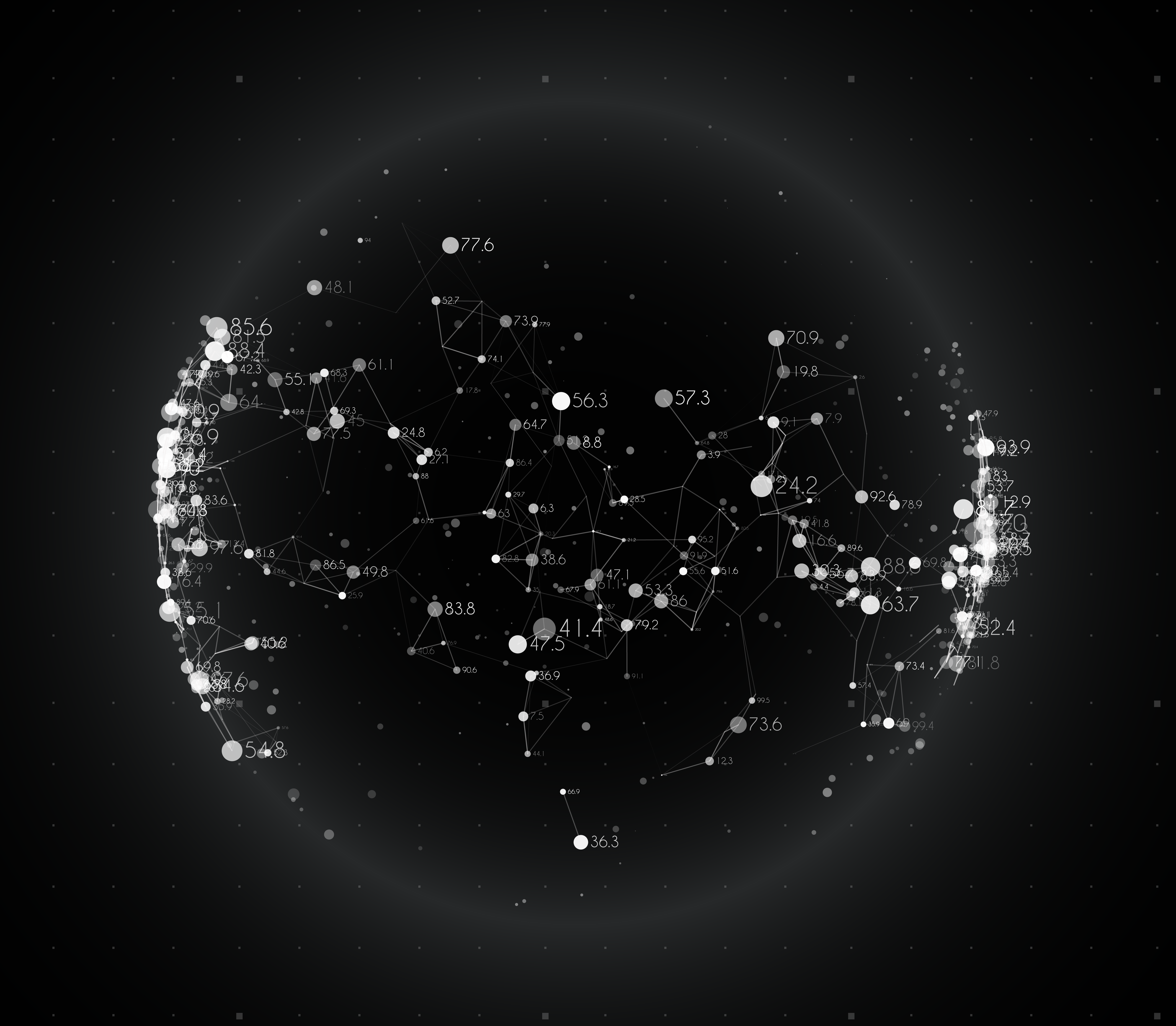
Crime-Park Correlation Dashboard
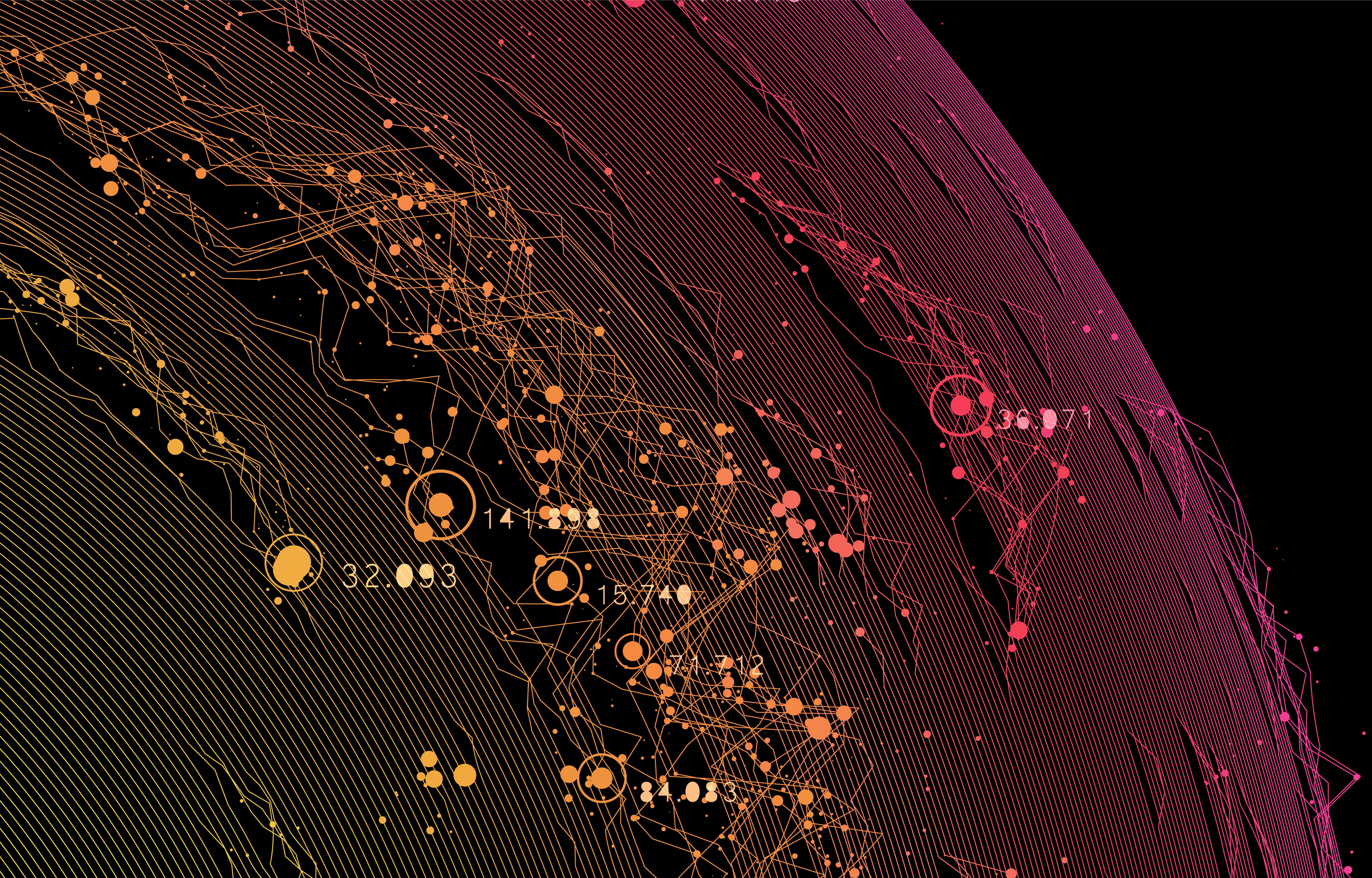
This dashboard combines 10 years of urban crime and environmental data to let you explore their relationships at the district (gu) level across major Korean cities. It provides an interactive visualization that analyzes how environmental factors move with crime outcomes, city by city.
- ✦ Time span: Last 10 years
- ✦ Spatial unit: Districts (gu) across multiple cities in South Korea
- ✦ Metrics: Crime rate, park-related indicators, population density, GRDP, etc.
- ✦ How to use: Choose a city and an indicator to update the map. Use the legend to read relative values. Zoom/pan with the mouse; click a district to focus.
Interpretation note: The visualization shows correlations, not causation. Please consider local context and other factors (e.g., demographics, development) when interpreting patterns.
Color Diagram
Explore the relationship between text and color — This project introduces a text-based color recommendation platform built on natural language processing (NLP). By analyzing written input such as words, phrases, or short descriptions, the system recommends color palettes that reflect both semantic meaning and emotional tone.
- ✦ Focus: Mapping language to perceptual color choices
- ✦ Tools: NLP (transformer-based models), Semantic Analysis, React for visualization
- ✦ Effect: Reveals how linguistic features (mood, metaphor, affect) can be expressed through color
- ✦ Interaction: Type any text to generate adaptive color palettes
Note: The live website is temporarily unavailable. Please follow the link to watch the demo video showcasing the platform’s features.
Toolkit
✦ QGIS ✦ D3.js ✦ AI ✦ Semantic Network Analysis